Content by:
Kunle Akoleowo, Senior Graphic Designer
Every rebrand begins with a strategic decision. Rebrands can signal a shift in meaning, identity and ambition. They can prove a business is ready to grow with intention. To invest in what’s next. And to recognize that where they’re heading is just as important as where they began.
When Gambler First Nation approached us, they arrived with certainty in who they are, what they believe, and the history, heart and purpose that makes them powerful. They just needed a strategic partner to help unlock their new business ethos and bring it forward with design clarity.
From Western Nations to Falcon Fuel
During discovery, we collaborated with the community’s leadership to uncover insights that would ensure authenticity. One name stood out: John “Falcon” Tanner, a foundational figure of the Ojibwe people.
Beyond this historical link, the Falcon, known in Ojibwe as zhiibingo-naniisi, carries spiritual significance. It represents speed, focus and resilience, and is regarded as both a powerful hunter and a messenger between physical and spiritual worlds.
This symbolism shaped the new name, Falcon Fuel. It reflects agility, strength and purpose, all qualities deeply tied to the community.

Designing with Cultural Relevance
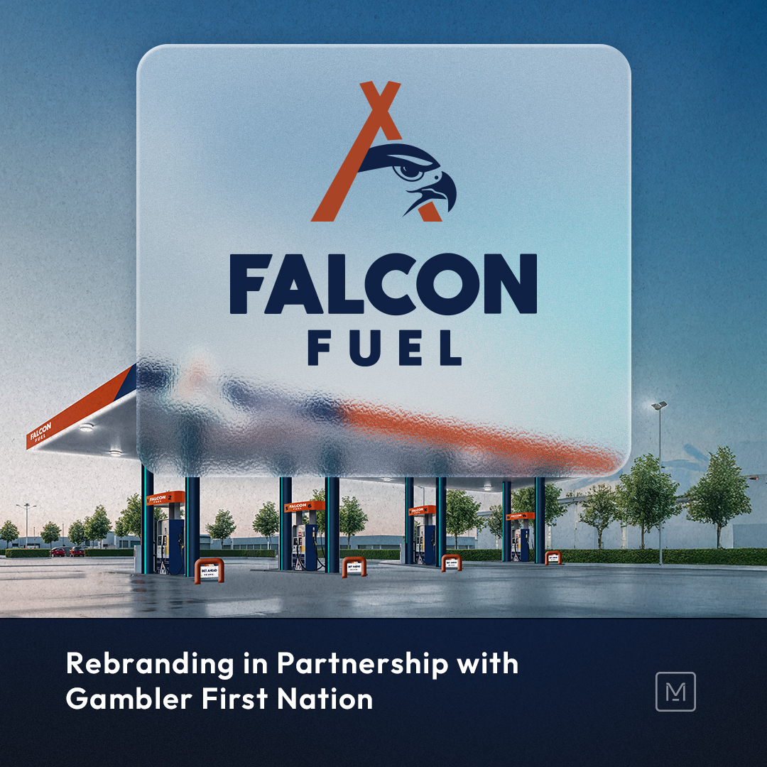
The visual identity draws from Ojibwe symbolism and presents it through a modern and confident lens. The Teepee-inspired mark forms the core of the identity. Two intersecting lines suggest movement and focus, while the Falcon’s head within the shape communicates vision and determination.
The Power of Colour
The Falcon Fuel palette blends cultural warmth with modern appeal. While their Oxford Blue brings trust and professionalism, the Rust hue reflects the land and the community’s resilience. Almond shade offers a more welcoming warmth while using the Robin Egg Blue to introduce optimism and renewal.
These colours express the values of Gambler First Nation and help Falcon Fuel stand out in a category dominated by traditional corporate tones.
Patterns of Unity
A custom brand pattern was developed using the triangular geometry of the Teepee. Its interlocking motifs represent connection and shared purpose, highlighting the collective spirit of the community.
More Than a Brand
The Falcon Fuel project is a strong example of how culture, collaboration and creativity can create something powerful.
As new stations open across Western Canada, Falcon Fuel stands as proof that heritage and design can work together to drive innovation. It honours roots, inspires movement and supports its promise to help communities, travelers and partners Get Ahead.
At Mash Strategy, our work focuses on finding the stories, values and insights that make organizations unique and expressing them through thoughtful strategy and design.


.jpg)
