Content by:
Greg Tobin, Creative Strategist
If you haven’t seen it yet, you should gosee the new cracker barrel logo.
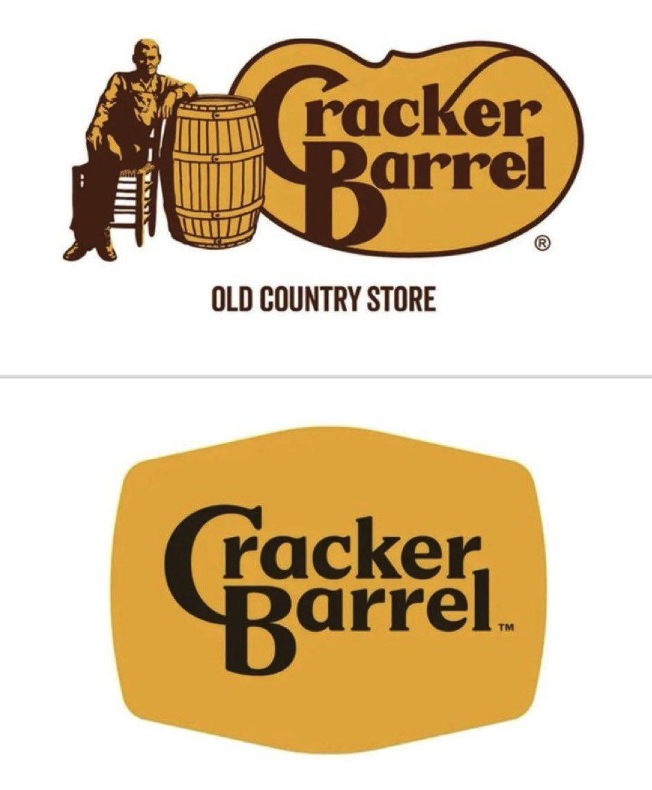
It's awful.
The company began working on a brand refresh about a year ago, and has nowproduced both a new logo for itself, as well as beginning remodels for itslocations across the U.S.
But yeah, it's awful.
The response has been near universal disgust at the soulless logo.
It took the iconic barrel of the cracker barrel out of its logo.
And this incident gets to the heart of a pitfall in marketing and branding thatI see all the time.
Well, two pitfalls. One that is an evergreen pitfall and another that is moreapplicable in the modern time.
1. The first is - if it ain't broke -don’t fix it.
Cracker barrel, with the exception of 2020(we don’t talk about that time) has seen a regular and steady increase in its yearly revenue for decades now. It wasn’t in dire straits. It was doing fine! Well even!
But humans are incapable of sitting still, and when those energies are directed at make-work projects it usually backfires. Rather than refresh the menu, or do a bold new marketing campaign based on its past success - they chose to go the doomed route of changing their brand.
9 times out of 10 - unless you have a very serious and substantial reason tochange your logo or your brand - DO NOT DO IT.
Logo refreshes are fine, updating a font, updating a character to be more compatible with printing or so you can have it stitched onto a golf shirt and hat. That’s totally fine. Completely upending what makes your brand’s logo stick out - is a BAD IDEA. Brand re-do’s also come with the risk of alienating your audience simply for the fact that they won’t recognize you anymore. Your brand is the key to building trust and authenticity with your audience, you mess with that at your peril.
There’s a reason coke cans to this day still say “original taste” and it'sbecause “new coke” sucked that bad. It wasn’t even the flavour - taste testing showed people liked new coke better on blind testings (Pepsi was considered sweeter and was winning out coke in some markets). But the public hated that the company was perceived to be changing an established icon. And the counter “return to tradition” that coke scrambled to do in the aftermath worked so well.
Other companies like Jaguar and Bud Light have also fallen into the pitfall of trying to change their brand to huge public out cry. And brand adjustment includes BOTH your logo, and how you present yourself to the public.
In the book the 22 Immutable laws of marketing, Rule 4 is the Law of Perception. Marketing is not a battle of products, but a battle of how peoplesee your products. And how people perceive your products is built on your Brand’s history, your marketing, and the audience(s) you have captured to purchase your product.
Bottom line - if you have a dedicated audience who keeps coming back to give you money for your product, do not change that product. Change instead how you talk to your audience. Try something new with your marketing, without changing who you are. But be true to your brand.
2. And the second is - right now, we’re coming out of the age of brand simplification.
During the millennial era up to the early 2020s, so many companies were simplifying their logo. It's just what the fad was. Companies switched from big bold fancy icons, getting rid of words or complex images to reduce them down to simple polygons and one-word phrases. It was seen as making designs "elegant" and “sleek”. You see it in things like the Starbucks Icon, or the Instagram icon.
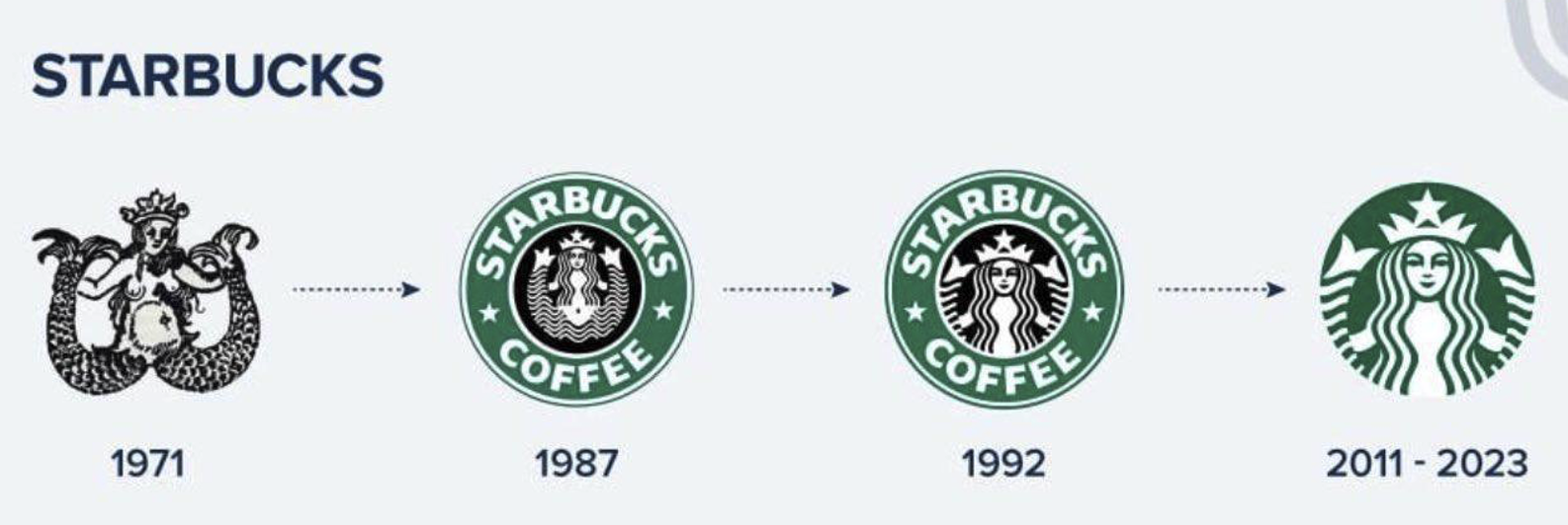

But now, the reverse trend is happening. Simple redesigns of old more complex logos are being criticized as being “souless” and the culture is now fighting back against the grey-ification of everything. In response companies like Burberry for example, which had simplified their logo, are now switching backto their iconic older look. Mountain Dew, Burger King, Pepsi, and many othersare “returning” to older beloved versions of their icons too.
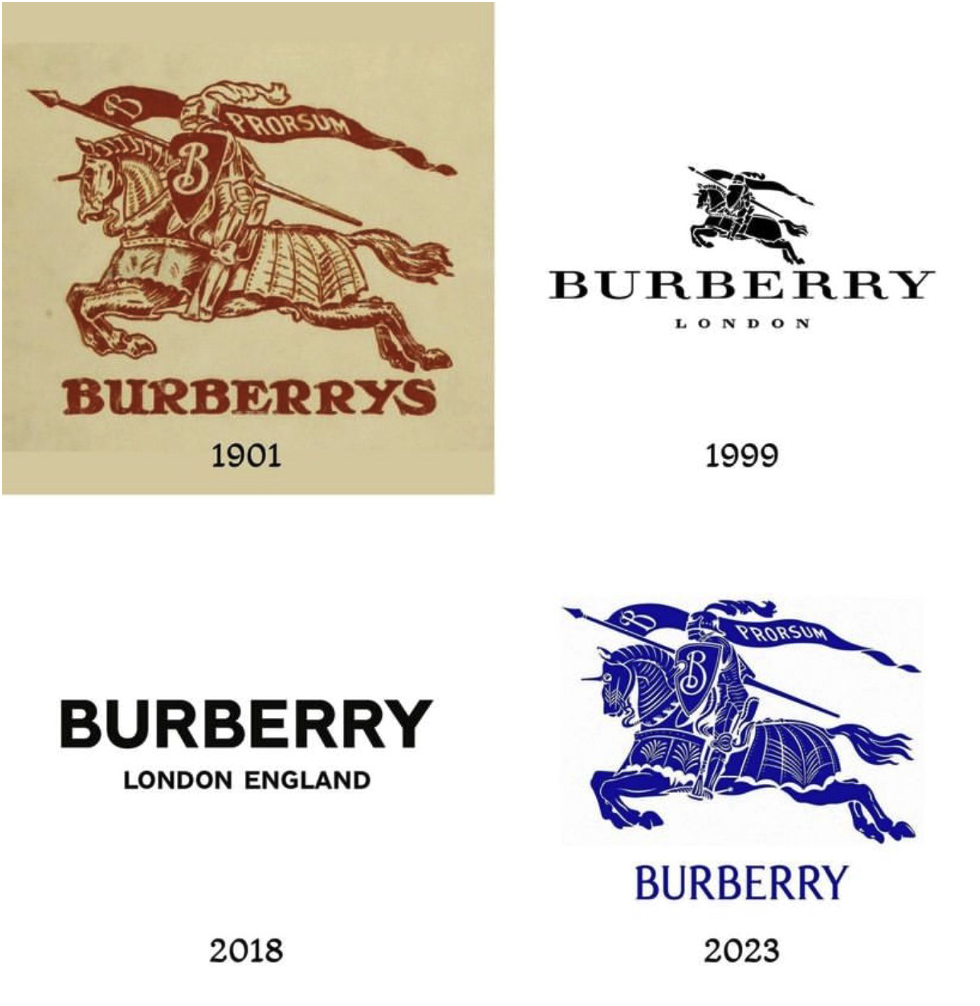
Bottom line - don’t fall for the trap ofchange for change’s sake. Change for a good reason can be good! Sometimesyou need a total re-do because of controversy, because of a lack of brandawareness, because sometimes a brand logo is actually too complex. A goodexample of this is the apple logo from its original to its 1977 logo. Its iconic. Everyone knows what brand it is, and its original design with thecolours looks great.

But don’t change for the sake of change. 9 times out of 10 it's a BAD IDEA.
Instead try a bold new marketing plan, find new ways to talk to your audience, new markets to get into.
Remember - idle hands are the devil’s play thing. And the devil loves bad logos.

.jpg)
.jpg)